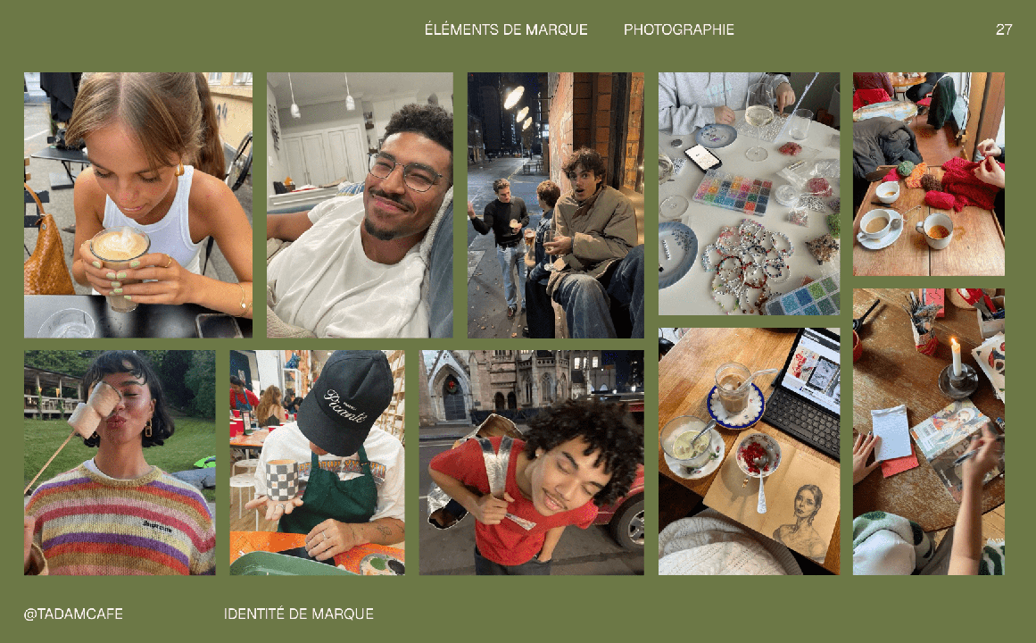
Tadam

Branding of a creative coffee shop

Tadam full logo with tagline

What started it?

Tadam started with a simple dream from Julie: create a place where you could drink something warm, slow down for a second, and just… make things with your hands. No pressure, no “I’m not creative,” no performance. Just a cosy bubble where you can reconnect with yourself through clay, paint, or whatever medium finds you that day.

This project felt like designing a hug — soft shapes, playful colours, illustration bits that look like modelling clay. A brand universe where you can arrive tense and leave with a latte in one hand and a tiny “tadam !” in the other.

works

Tadam coffee cup
Tadam Instagram PostTadam Instagram PostTadam Instagram Post
Motion intro for Tadam

Approach

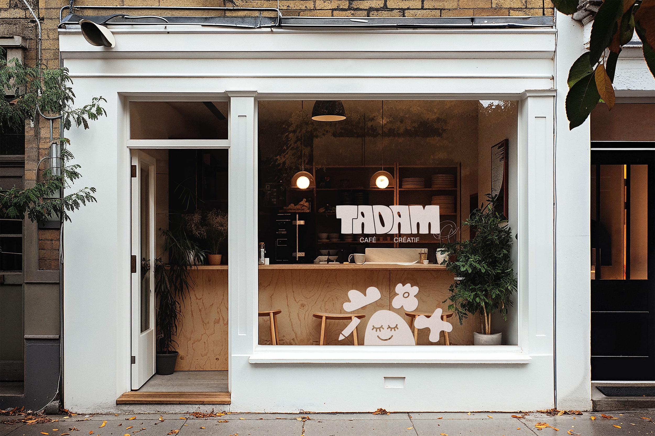
Our goal was to build an identity that embodied cocooning, creativity, and sharing — the three emotional pillars of Tadam. The design direction mixes softness with energy, making the brand instantly warm and accessible while keeping it contemporary and distinctive.

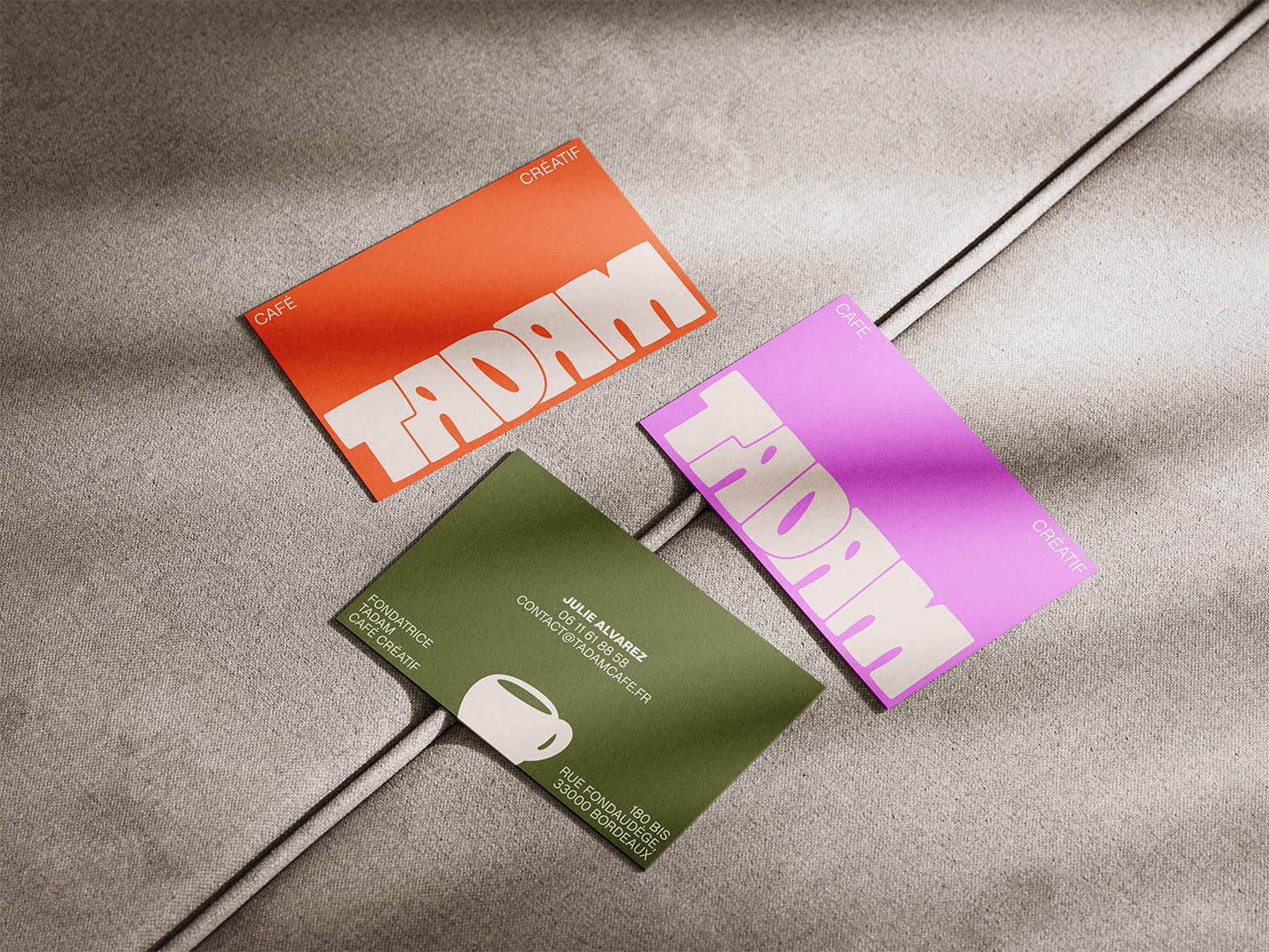
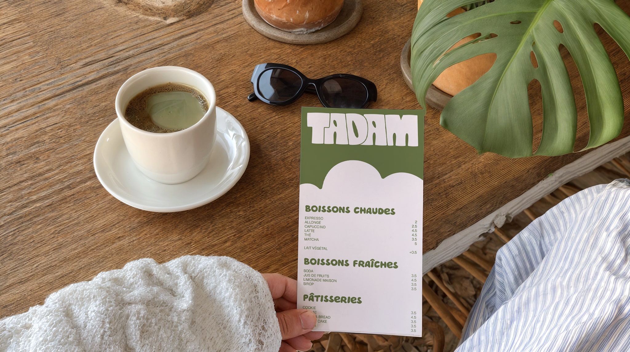
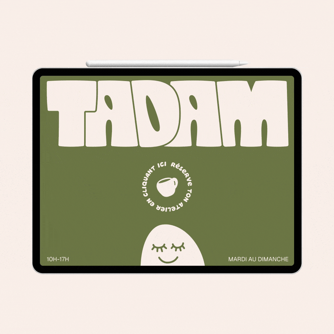
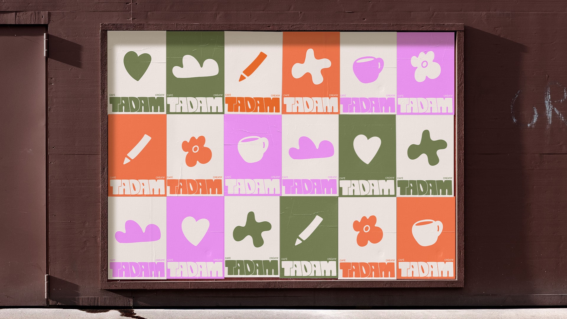
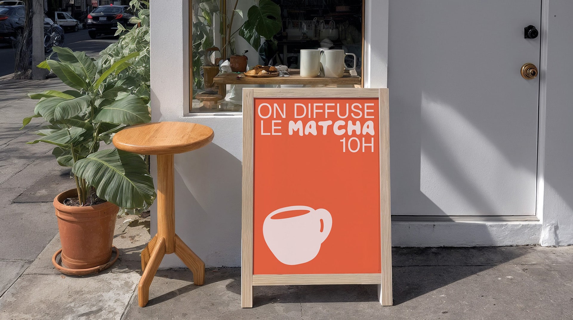
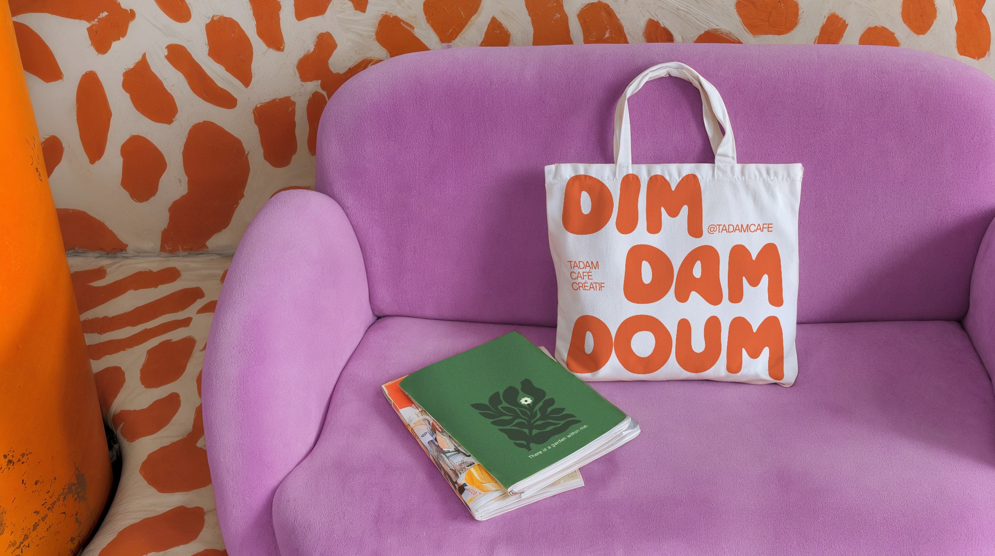
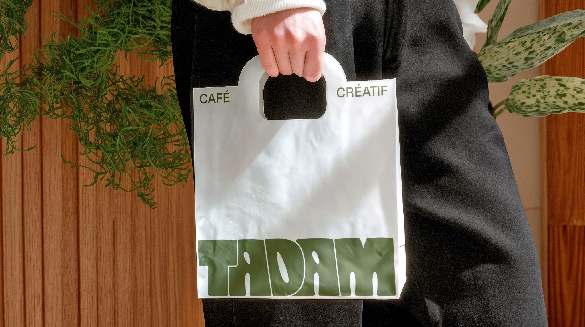
Logotype: The logo features wide, rounded, interlocking letters — a visual translation of conviviality, community and the tactile joy of handmade creativity. Its generous forms create an immediate sense of welcome.

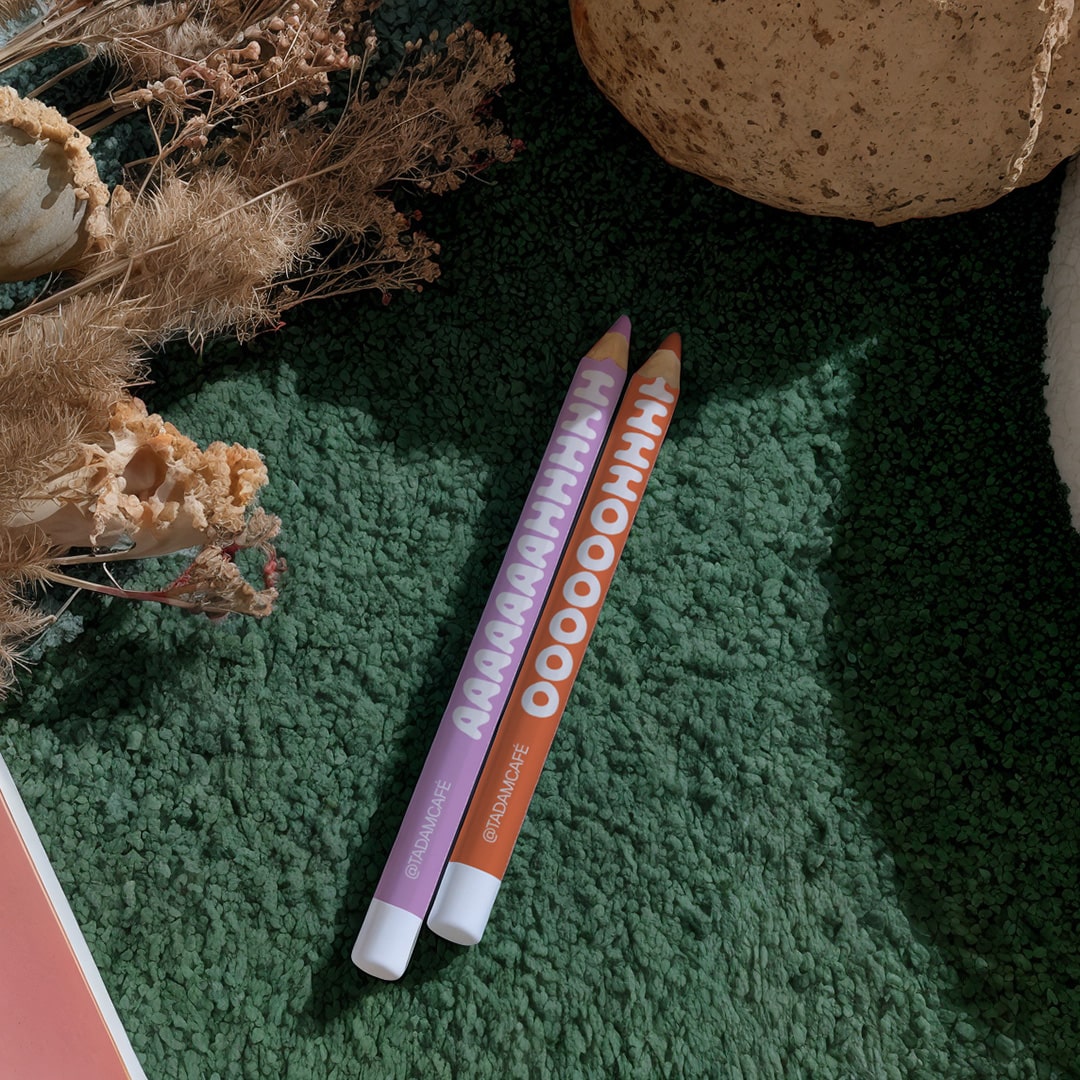
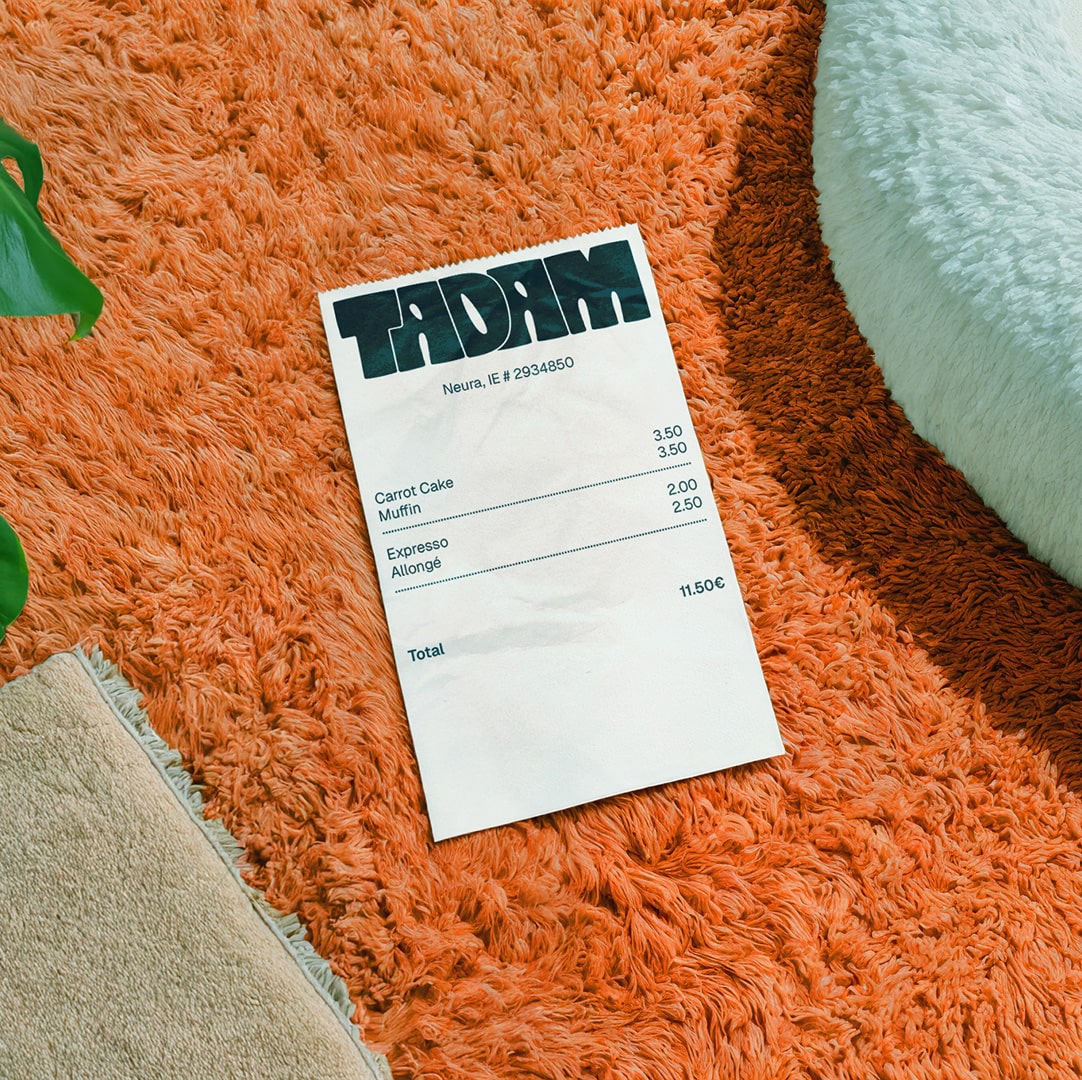
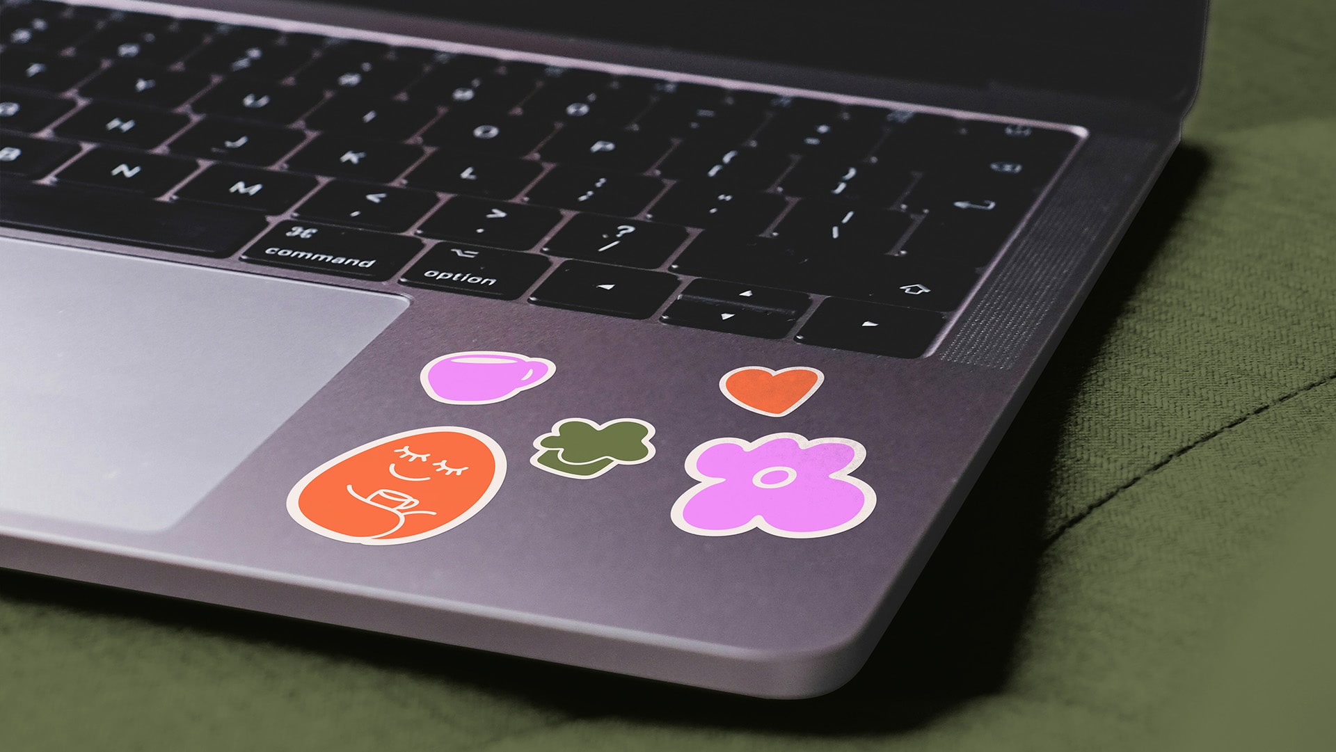
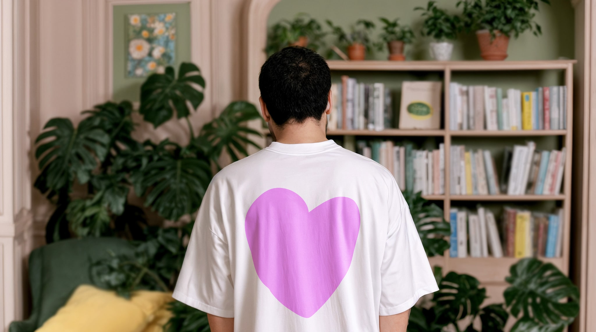
Color palette: Soft yet vibrant tones (rose, orange, kaki, écru) reflect Tadam’s balance between cocooning calm and joyful expression. The palette is warm, human and seasonal, echoing the textures of craft materials.

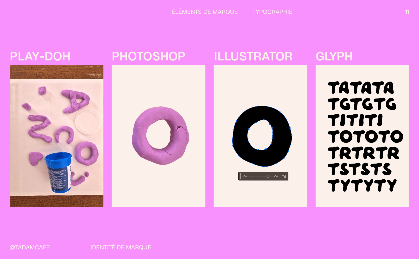
Typographic system: Geist for clarity and approachability; Tadam Regular for personality and playfulness. The contrast in sizes adds rhythm, while the overall direction remains friendly, modern, and accessible.

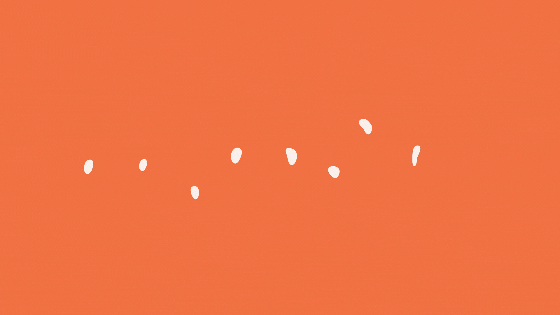
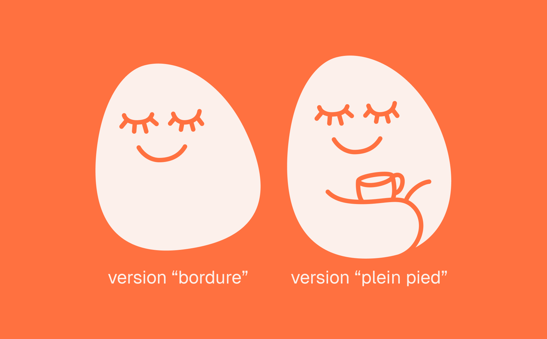
Illustration language: Inspired by modelling-clay shapes, the illustrations mirror the intuitive creativity of Tadam’s workshops. Round, flexible and playful, they add softness and spontaneity across applications. The final identity gives Tadam a universe that feels like a creative cocoon — a place where you can sit, breathe, explore, and rediscover the joy of making.

Tadam business cards
pencils for tadam coffee shopreceipt for tadam coffee shop
Tadam menui

Handmade Typography

The Tadam typographic universe includes a custom display typeface crafted entirely by hand. Each letter was first shaped using play-doh, giving the alphabet a soft, tactile, imperfect charm that mirrors the spirit of intuitive creativity found in the café. The shapes were then photographed, outlined in Photoshop, and vectorized in Illustrator, where the curves were softened and refined. Final adjustments — spacing, balance, kerning — were completed directly in Glyphs, ensuring that the typeface remains both expressive and functional.

The result is a warm, human type system that carries the joyful, handmade essence of Tadam in every letter.

Making of Tadam Regular, a typography made with Play-Doh
Tadam stickers
Website landing page for Tadam
Tadam Tshirt

Tadoum Character

Tadoum is the emotional mascot of the brand: a soft, joyful character that extends Tadam’s cocooning energy. Two versions exist — one as a border illustration, one full-bodied — allowing him to appear discreetly in corners or take center stage when storytelling is needed.

Tadoum adds tenderness and humanity making the experience especially relatable for families and children.

Tadoum character for Tadam
Tadam posters
Billboard for Tadam
Tadam tote bag

Photography Direction

Tadam’s photography celebrates real moments: candid gestures, smiles caught unexpectedly, POV shots of hands creating, warm textures, and spontaneous interactions. A subtle fisheye effect brings intimacy and immersion, while occasional collage-style cutouts add a fun, hobby-aesthetic touch.

Directon of Photography for Tadam
Next Project
Next Project
Next Project
Next Project
Next Project
Next Project
Next Project
Next Project
Next Project
Next Project
Previous Project
Previous Project
Previous Project
Previous Project
Previous Project
Previous Project
Previous Project
Previous Project
Previous Project
Previous Project